Yesterday in class, we had a group discussion about design magazines. We were able to talk about the typography, story selections, and even paper choice and art decisions made within the pages of the magazines. We all had different magazines, and I read STEP inside design. Here is an example of what STEP looks like.

My issue was a typography issue, and I had fun thinking about potential reasons for the letters and fonts that were chosen throughout the magazine. The beautiful designs were showcased in many different ways in the different magazines, and it really made me think about what innovative design. How do you create innovative design? So much of what I create comes from inspirations or ideas that I have seen in other places, and I love thinking about where the designs in the design magazines came from.
We discussed elements Lupton's Thinking with Type book, and created connections between the letters, text, and grids that we saw in the magazines to the examples in the book, and how each magazine used these items in their own ways. I loved opening the text and the magazine side by side, and identifying specific examples of the fundamental elements of design. It was a great discussion!

critique...department number four
This week, I designed my fourth ARTS department page for Vox. It's awesome to see how the process get quicker and easier each week. The biggest struggle I had when designing this Sunday was trying to fit all of the text onto my single department page. I had an anchor story, a lengthy sidebar, and a recurring section - all with photographs - to fit on the page. I have never had a sidebar on my page, so that was a new challenge. Luckily, my editor happened to be in the Vox office, and she was able to see firsthand how tight everything was. It was great that she was able to see it then, rather than days later with an attached page of overflow text. We are starting to see the struggles that each role within Vox has, and it is enabling us to work together more closely.
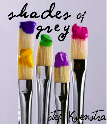
you can't miss...typography in adverting
There are some awesome new things going on in Veer, the blog that I follow weekly. The newest post is about typography in advertising, and the creativity behind these designs are incredible.

Once I clicked on this image on the Veer site, I was linked to a page with hundreds of typography designs! Here are a few of my favorite, all of which I pulled from this amazing blog. See if you can identify what the design is advertising. Some use food, some use paint, and others just remind me of incredible installation fibers art projects that I spent a semester learning about last year.


Have a great week!

No comments:
Post a Comment